
Ren's Pets Brand Identity Redesign
Class: Corporate Identity, Fourth Year
(school project)
NOTE: This project is a school project, and is in no way affiliated with Ren's Pets.
Project Objective
Redesign a brand identity system for an existing Canadian-owned establishment or organization.
Project Concept
My design concept for my chosen organization, Ren's Pets, was to integrate their values and personality as a company within their brand identity system in a modern and flexible design system. The redesigned identity also aims to integrate conceptual design in order to communicate these ideas.

About Ren's Pets
Ren's Pets is a Canadian pet supply store that prides themselves on their devotion to pets and their families, their customers, and their communities. They also believe that pets are deserving of the best quality products and care, and cater to a variety of pets, such as dogs, cats, birds, and several other smaller animals, like rabbits and guinea pigs.
Logo Redesign
Primary Logo (with Supporting Type)
The redesigned logo is a stacked, 3-colour wordmark that incorporates 3 major design elements that communicate and integrate their commitments to their customers, their communities, and pets. These include: the comment-like apostrophe representing Ren’s Pets’ communication and personal relationships they have with their customers; the orange rays conveys their excitement and willingness to serve and provide for their customers and their pets; and the heart that forms as the counter-spacing of the uppercase P in 'Pets', communicating their love and admiration for pets.
The redesign also consists of an updated tagline, "Helping pet families thrive", which aims to further communicate their commitments to helping pet families live well together.
Horizontal Logo (with Supporting Type)
A horizontal logo was also designed in order to establish ideal logo usage when vertical space is limited, or when a vertical logo application is best suitable.
Brand Elements
Brand Pattern
A brand pattern, known as the Brand Values pattern, was created for brand application uses, which integrates the 3 brand values established in the logo. Uses for the pattern includes a variety of brand applications, such as promotional items, store signage, social media posts, etc.
This pattern uses the original three brand colours, while also being flexible enough to adapt to colour tone changes that use 3 brand accent colours, or white.

Pet Icons
The green heart brand element was also used to design pet icons in order to represent the pets that Ren's Pets cater to. This helps to create more inclusion for a wider range of pets, rather than strictly dogs or cats.
Due to the fact that each type of pet has physical differences, a simple scaling system was established in order to accommodate these differences in a more cohesive way.
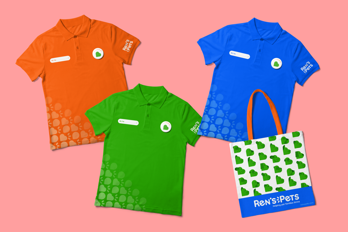
Brand Applications
These brand applications envision the brand identity system in several applications, which include:
- Employee uniforms
- Tote bag
- App design
- Letterhead, envelope and business cards
- Gift cards


Brand Standards Manual


