BOOK COVER DESIGNS.
BOOK COVER DESIGNS.
EDITORIAL & Illustration
DESIGN EXPLORATION
Photography Credits: Brittany Tena, Unsplash
Illustration Credits: Brittany Tena
Cover Copy Credits: Several Authors
-
Redesigning book covers for fun and personal design exploration.
-
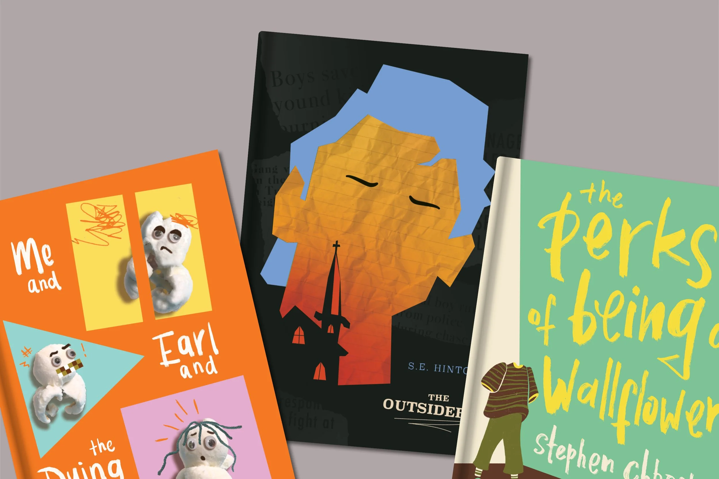
For the following book designs, the goal was to incorporate conceptual themes from each novel to drive the overall design and narrative for the following novels: Me and Earl and the Dying Girl by Jesse Andrews, The Perks of Being a Wallflower by Stephen Chbosky, and The Outsiders by S.E. Hinton.
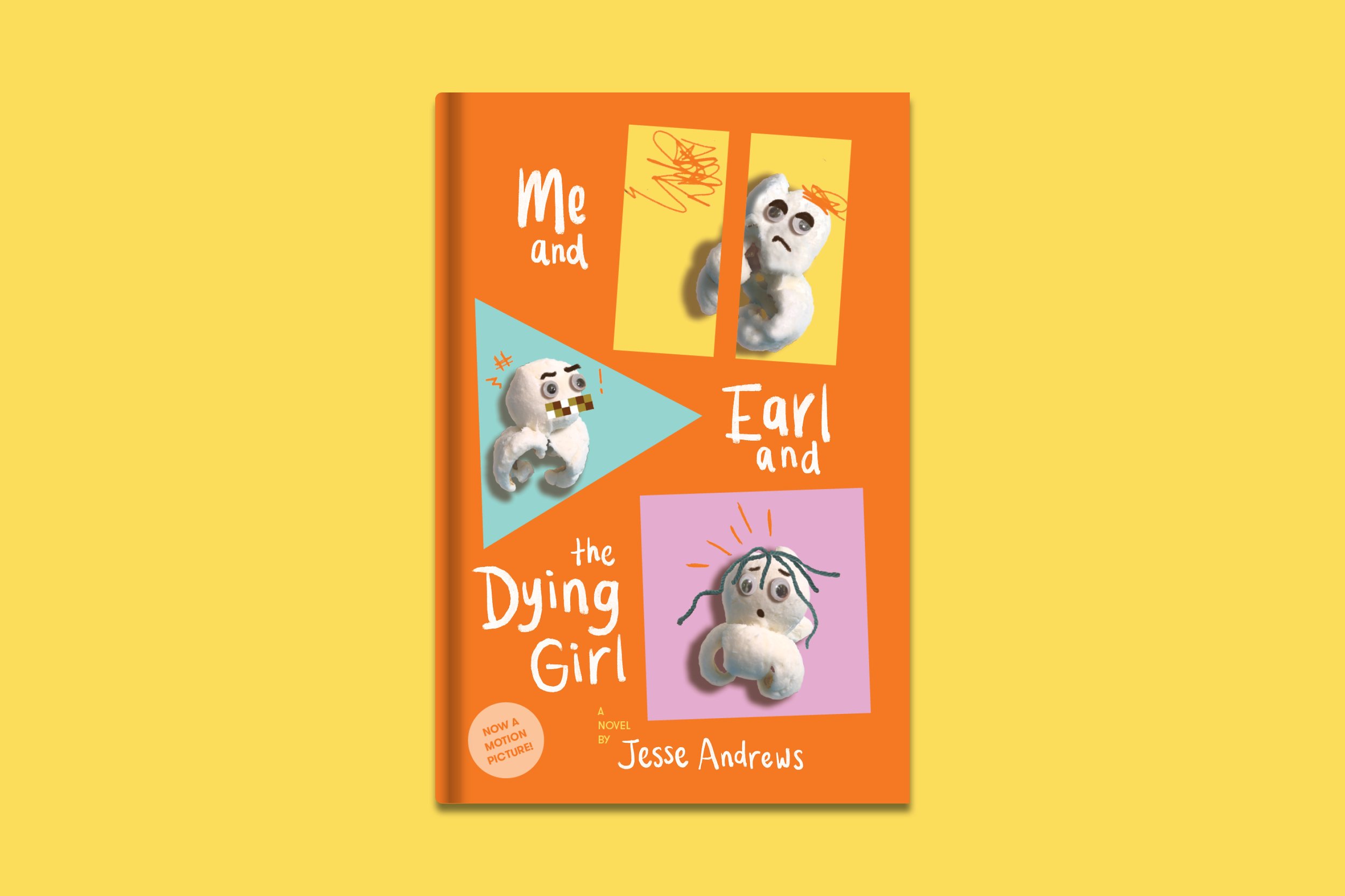
“Me and Earl and the Dying Girl” by jesse andrews
BOOK SUMMARY:
When he’s not doing his best to be invisible, high school senior Greg Gaines and his “co-worker” Earl Jackson make mediocre parody films for fun. Then Rachel Kushner, a past childhood friend, is diagnosed with leukemia, so Greg’s mom demands that he befriends her.
COVER DESIGN APPROACH:
The theme of Greg and Earl’s parody films is a driving force in the novel, as they allow each of the three characters to connect and bond. The cover embodies the comical nature of their movies and the three main characters, and their character stories and personalities as I felt they related to the viewing of films: PAUSE, PLAY and STOP. Greg is laid-back and sarcastic and uses humour to get him through his experiences in life, but once he befriends Rachel, he begins to put his own life on hold to make a film for her. And, when she later passes away, Greg is unsure about his life after graduation, thus being representative of “PAUSE”. Earl, on the other hand, swears a lot and is brutally honest, but he’s a devoted friend to Greg and encourages him throughout the events he’s experiencing in the book, thus embodying the notion of the “PLAY” function and driving force of the group. Rachel is battling cancer and coming to terms with her mortality, and at the end of the novel she sadly passes, thus representing the “STOP” function. Each of the three characters are embodied as popcorn characters on the cover, as they encapsulate the filmmaking narrative and comical feel of Greg and Earl’s movies, and the characters themselves.

“The Outsiders” by S.E. Hinton
BOOK SUMMARY:
Fourteen-year-old Ponyboy Curtis is known as a “Greaser” and a rival of the rich kid gang, the “Socs”. So is Johnny Cade. One night, the two of them experience something that changes the course of their lives, for both better and worse, forever.
COVER DESIGN APPROACH:
In the novel, “Greasers” have a reputation for being tough and rough-around-the-edges. Ponyboy, however, is very quiet and introspective, sensitive, and gets good grades. One night, he and Johnny Cade are thrust into a situation that got out of hand, leading them towards the pivital events that are hinted at through the depictions of a church and a switchblade. As their story progresses, Johnny does what he thinks is right to help a friend and develops a new love of sunsets, while Ponyboy is encouraged by Johnny to “stay gold” and write his story.


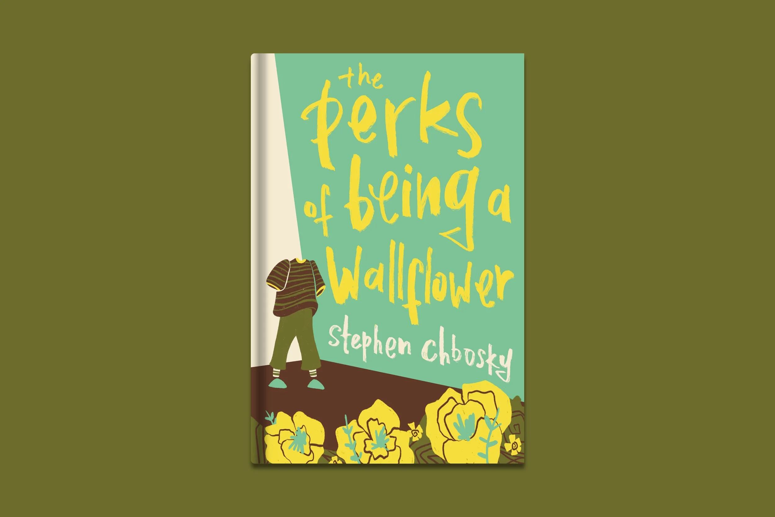
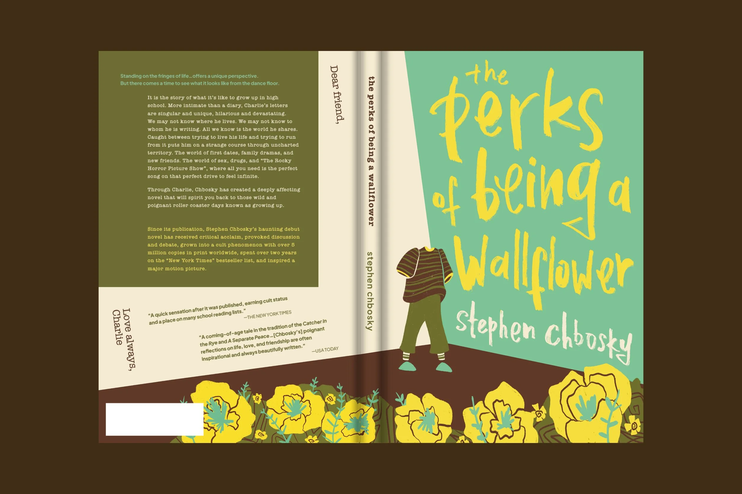
“The Perks of Being a Wallflower” by Stephen Chbosky
BOOK SUMMARY:
Charlie’s story is told through letters he writes to a “friend” about his life: his family, his lack of social life, his thoughts and feelings, and his aunt Helen. Charlie is described as a wallflower, someone who observes the world around him from afar and keeps quiet, and as the novel progresses and Charlie writes more letters about his experiences, he soon grows and evolves as a person.
COVER DESIGN APPROACH:
The front cover depicts a faceless figure standing in the corner of a room, representing the main character Charlie, as Charlie is somewhat anonymous to the reader and could look like anyone. This figure is surrounded by blooming flowers, representing the growth of Charlie’s character through his triumphs and struggles and his hopes for him and those around him. The white wall, when observed from the front to the back cover, is a nod to Charlie’s letters and how he addresses the reader.