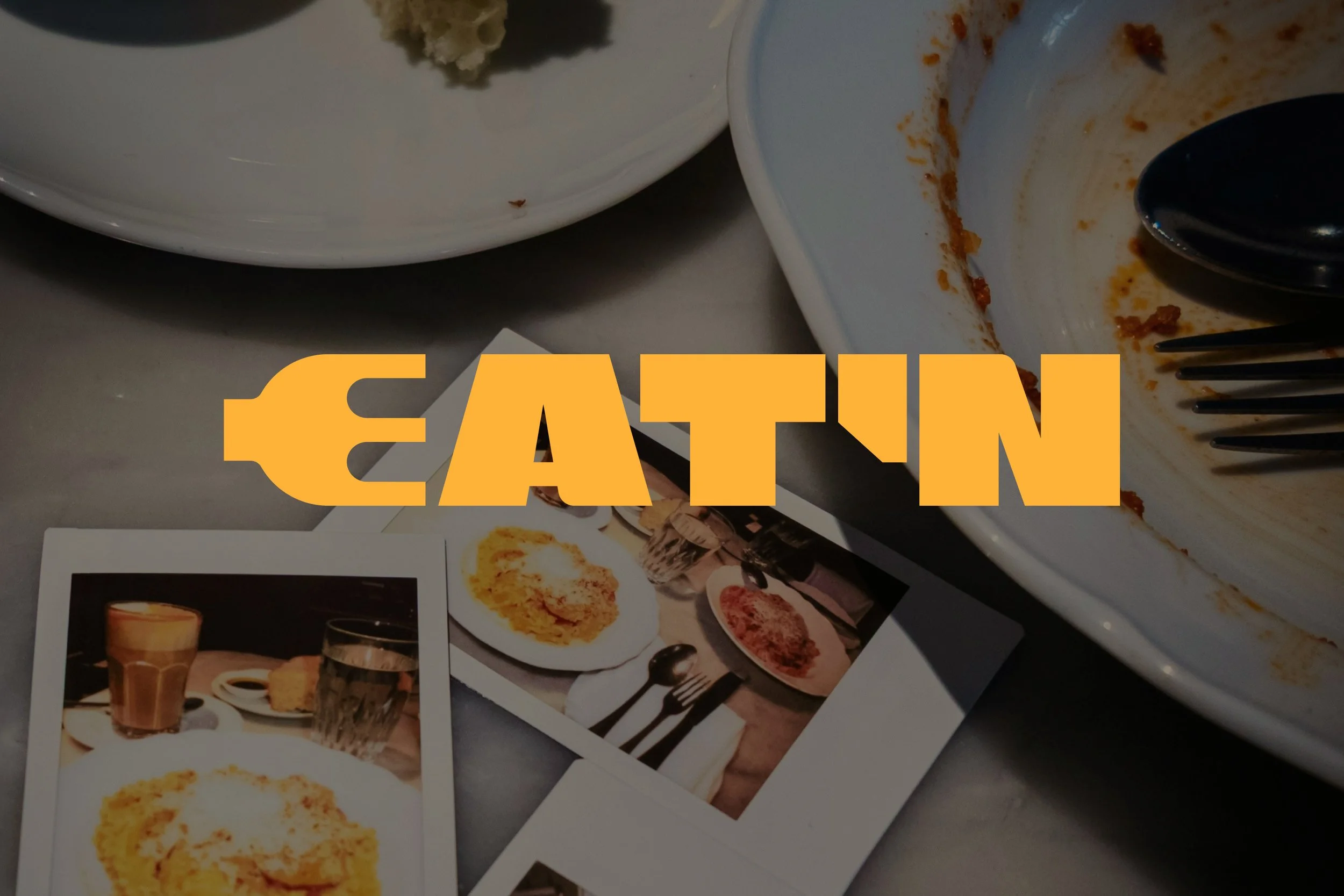
EAT'N.
EAT'N.
BRAND IDENTITY DESIGN
PERSONAL BRAND EXPLORATION
Photography Credits: Unsplash, Pexels
Copy Credits: Brittany Tena
-
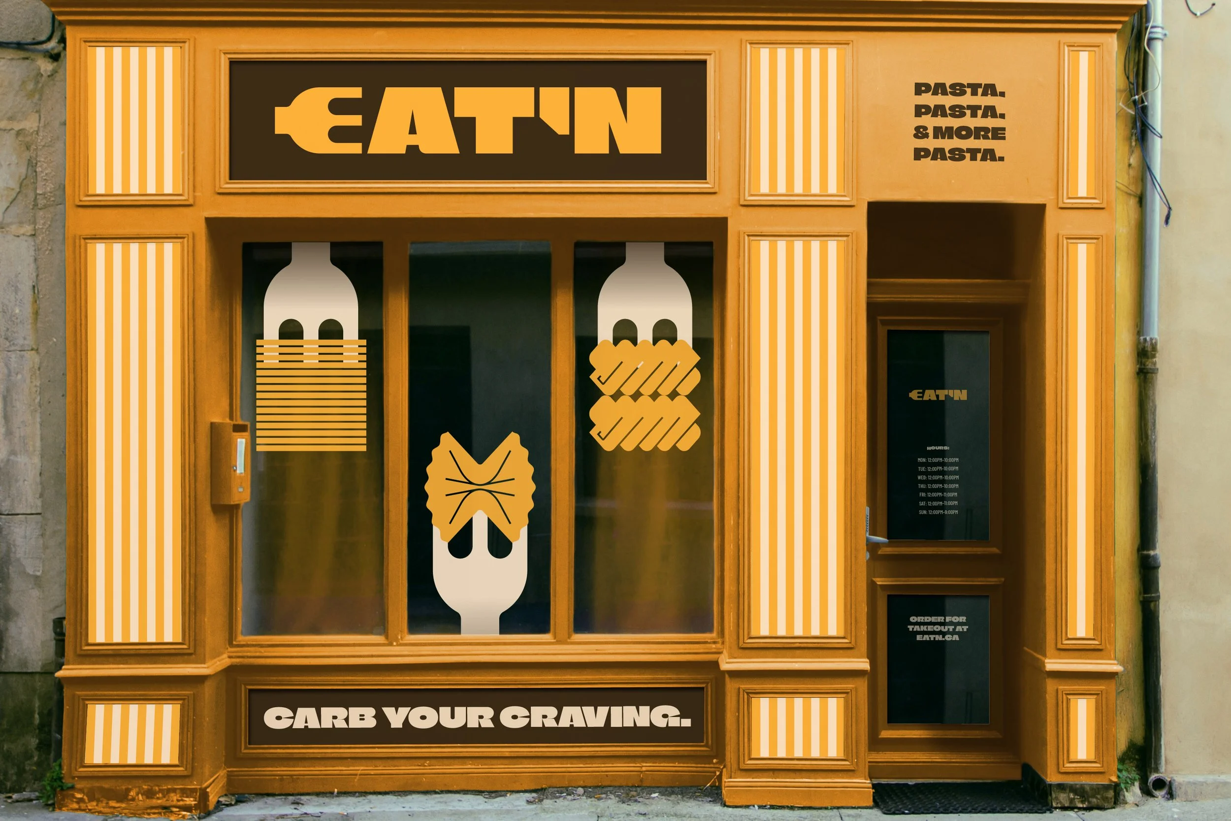
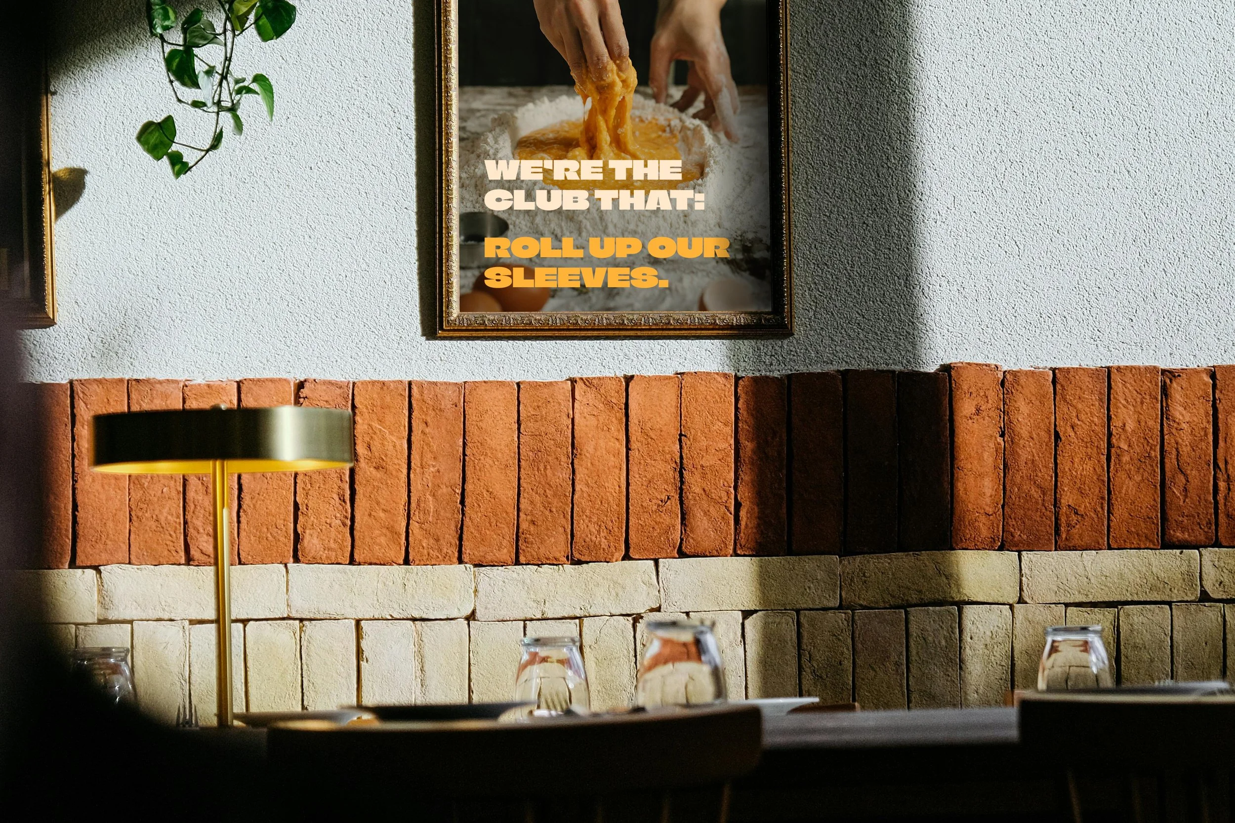
Designing a brand identity for a fictional pasta restaurant.
-
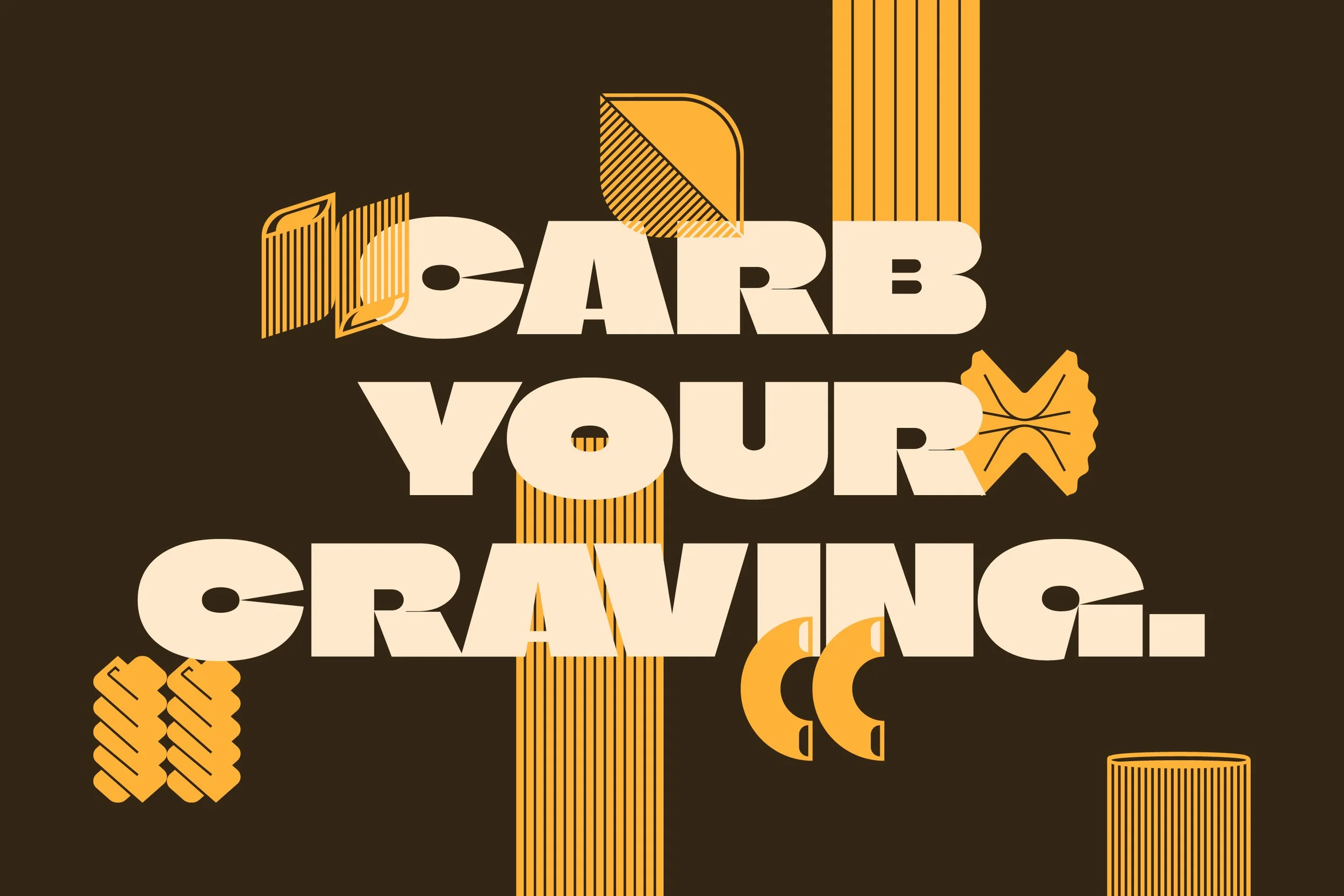
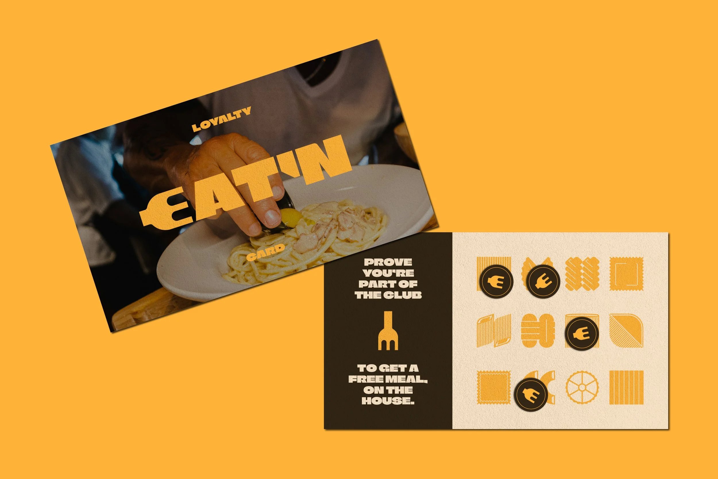
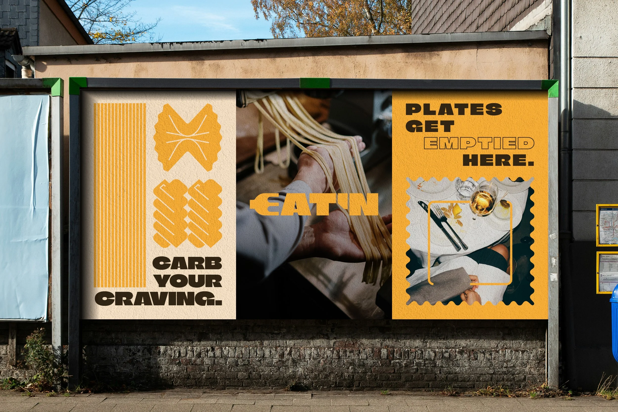
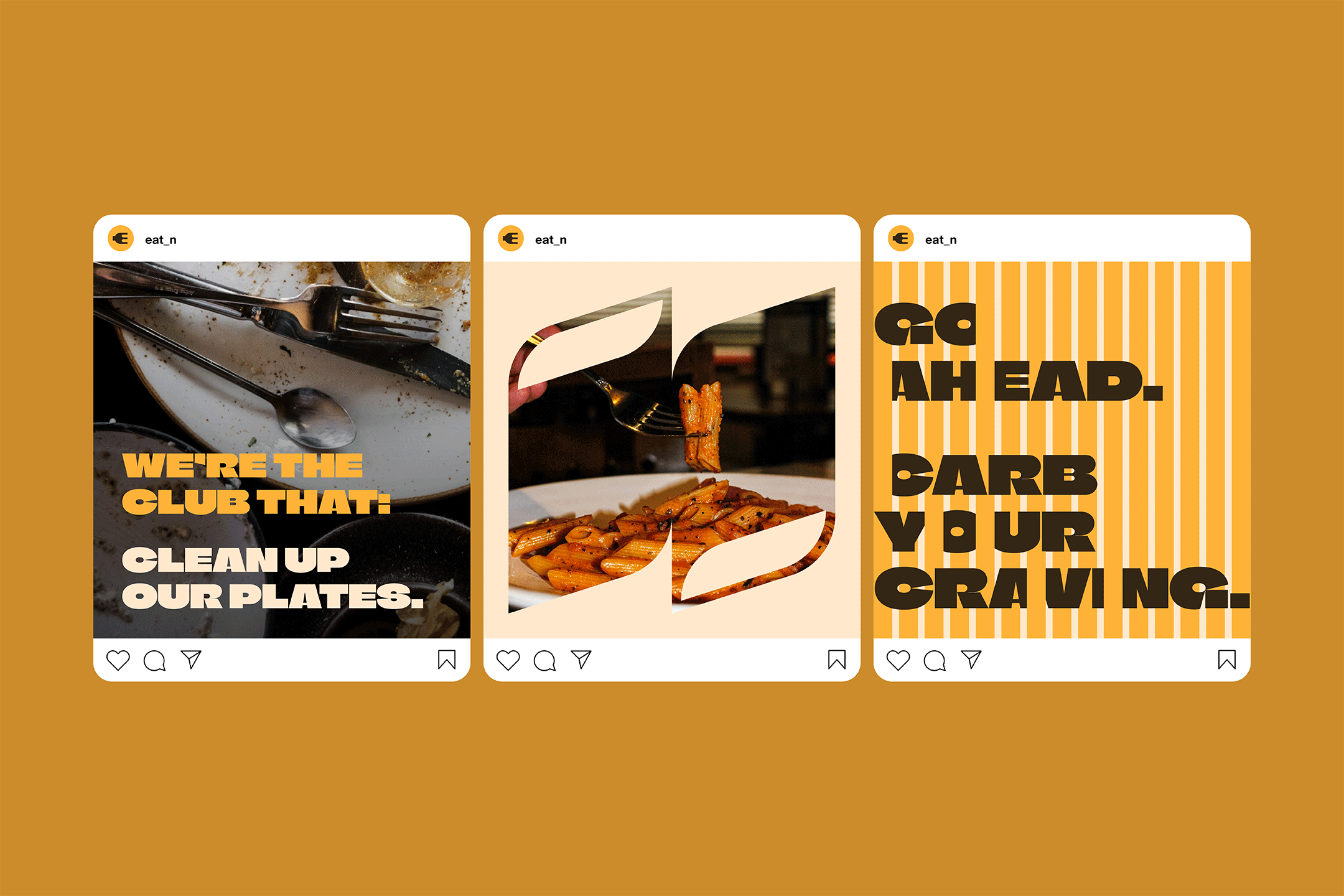
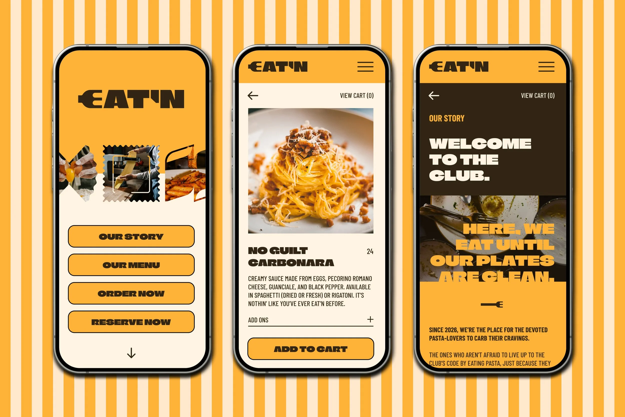
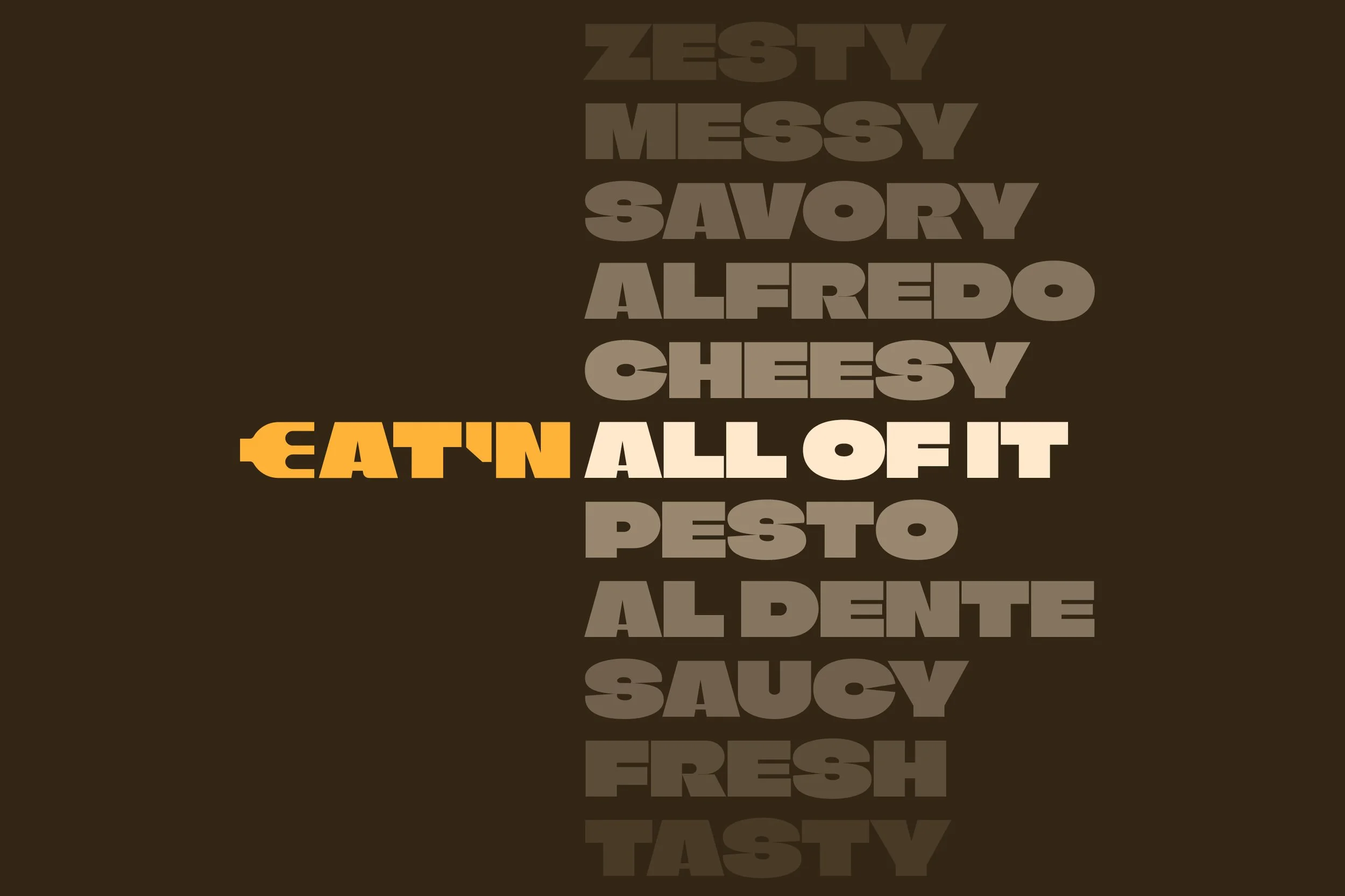
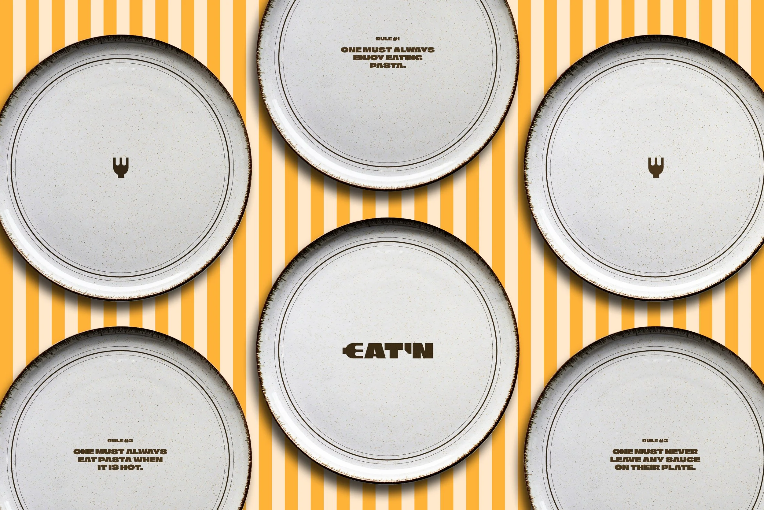
EAT’N is a pasta-lover’s safe haven. Where their rally cries are heard and celebrated.
It is the place where the plates are served full, and finished by being emptied. The ultimate pasta club, where its members go to carb their cravings, not curb them. It’s unapologetic in it’s offerings and approach: serve good food and enjoy doing it, so that customers eat good food and enjoy eat’n it.
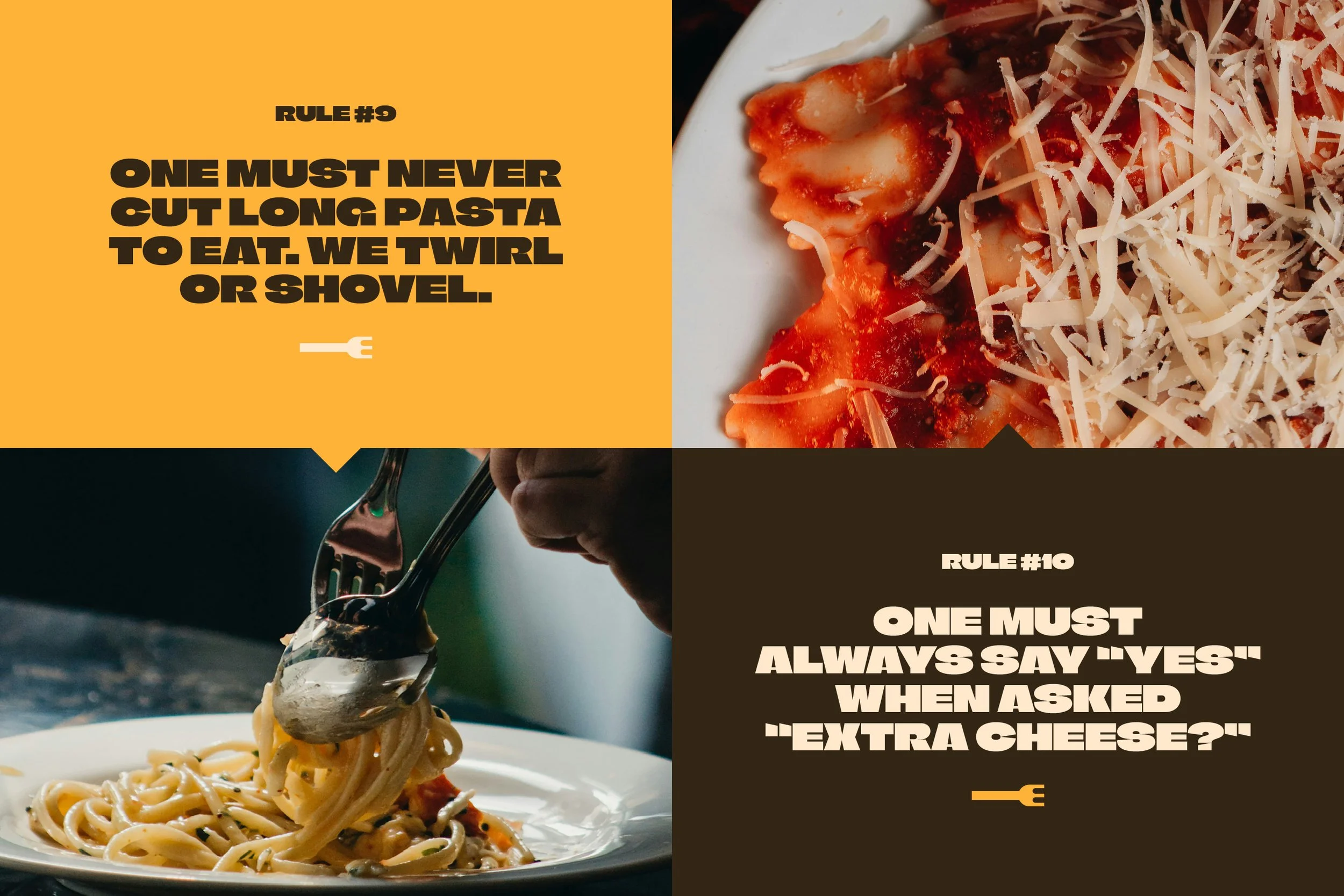
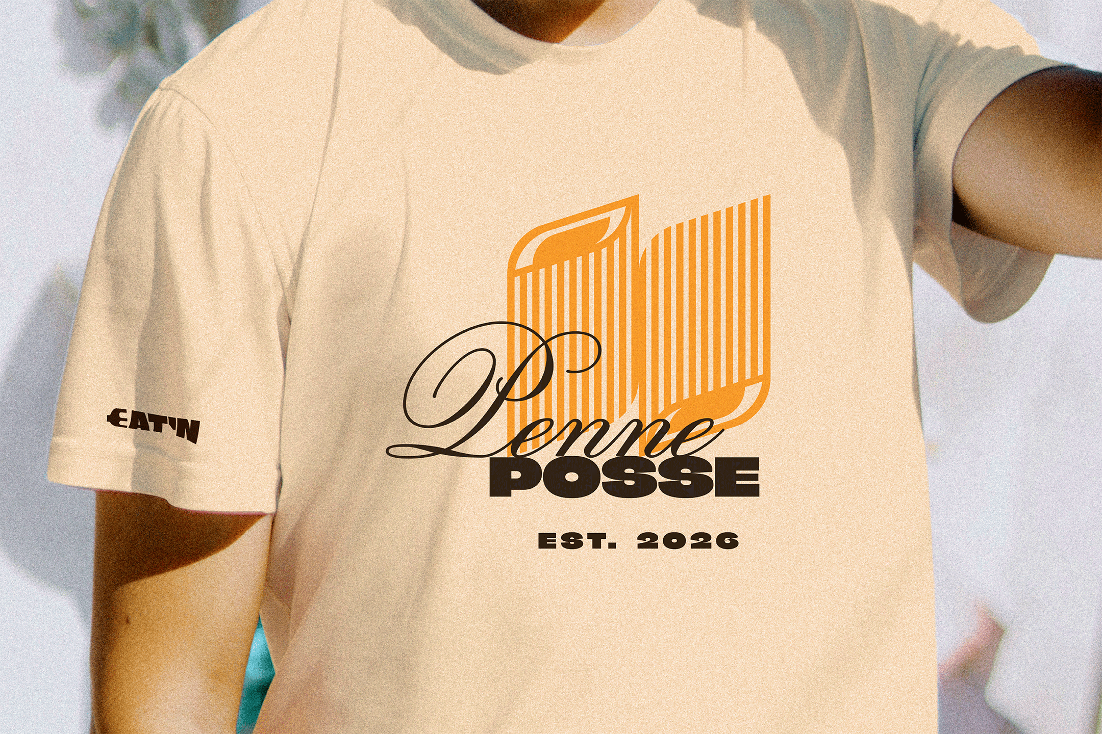
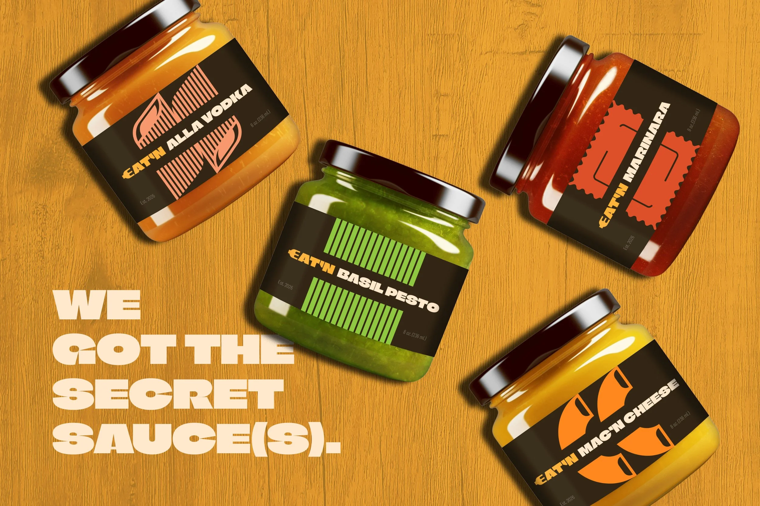
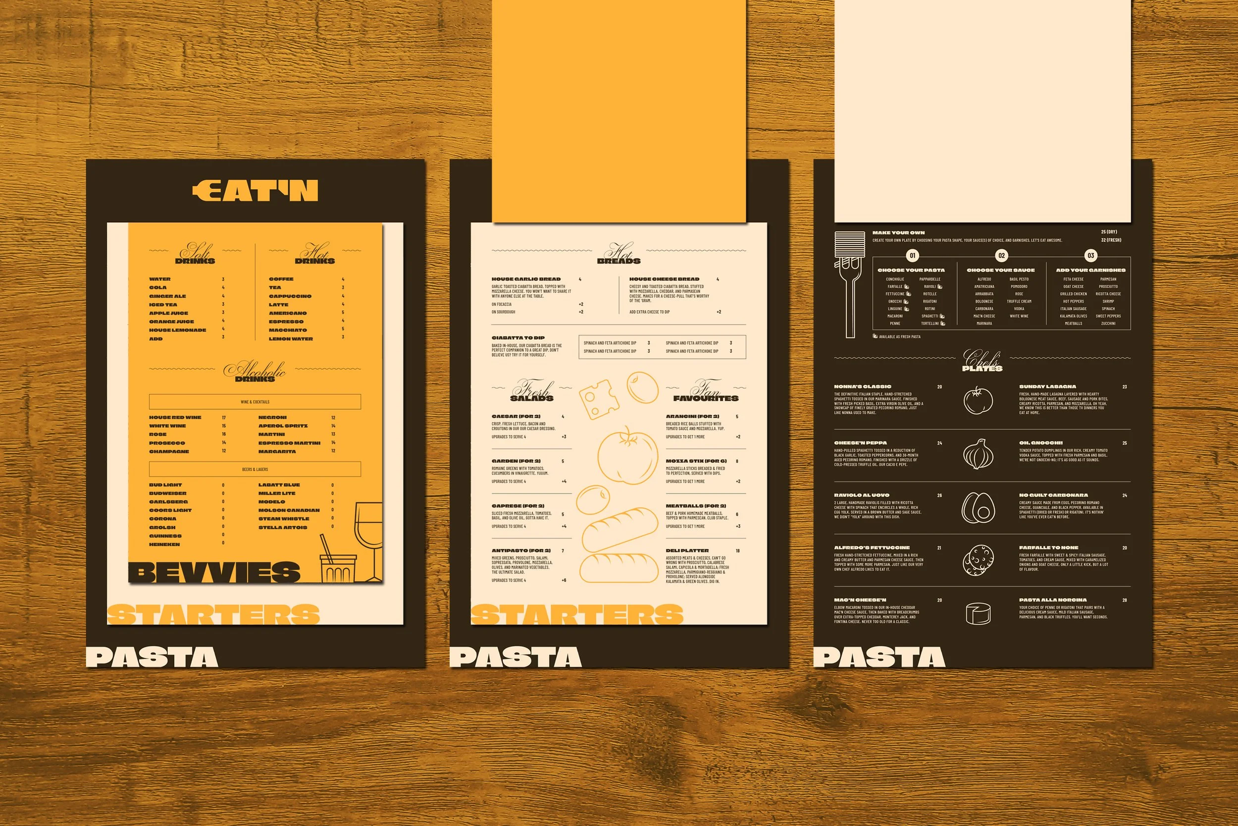
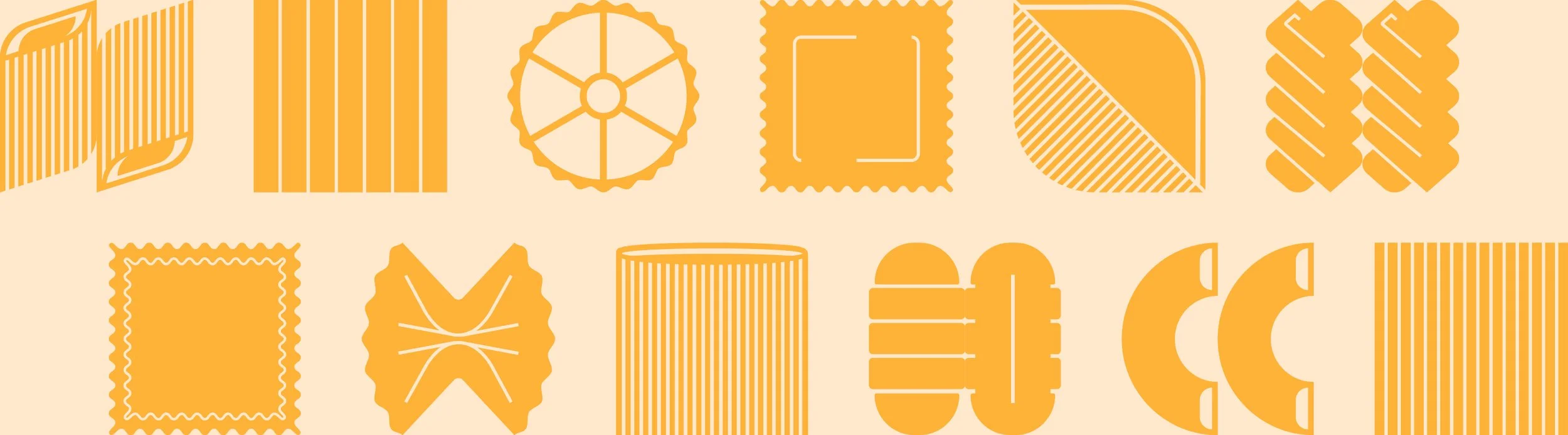
The brand identity was designed to show the audacious and daring, yet unifying nature of the restaurant’s pasta-loving, club-like mentality through bold uses of type and copywriting, iconographic pasta-shapes to reinforce the brand’s purpose, and not being shy about showing food—or empty plates—through impactful candid photography.