REN'S PETS BRAND IDENTITY REDESIGN.
REN'S PETS BRAND IDENTITY REDESIGN.
BRAND IDENTITY REDESIGN
SCHOOL PROJECT, 2021
Note: This is a school project, and is in no way affiliated with Ren’s Pets.
Photography Credits: Unsplash
Copy Credits: Brittany Tena
-
Redesign a brand identity system for an existing Canadian-owned establishment or organization.
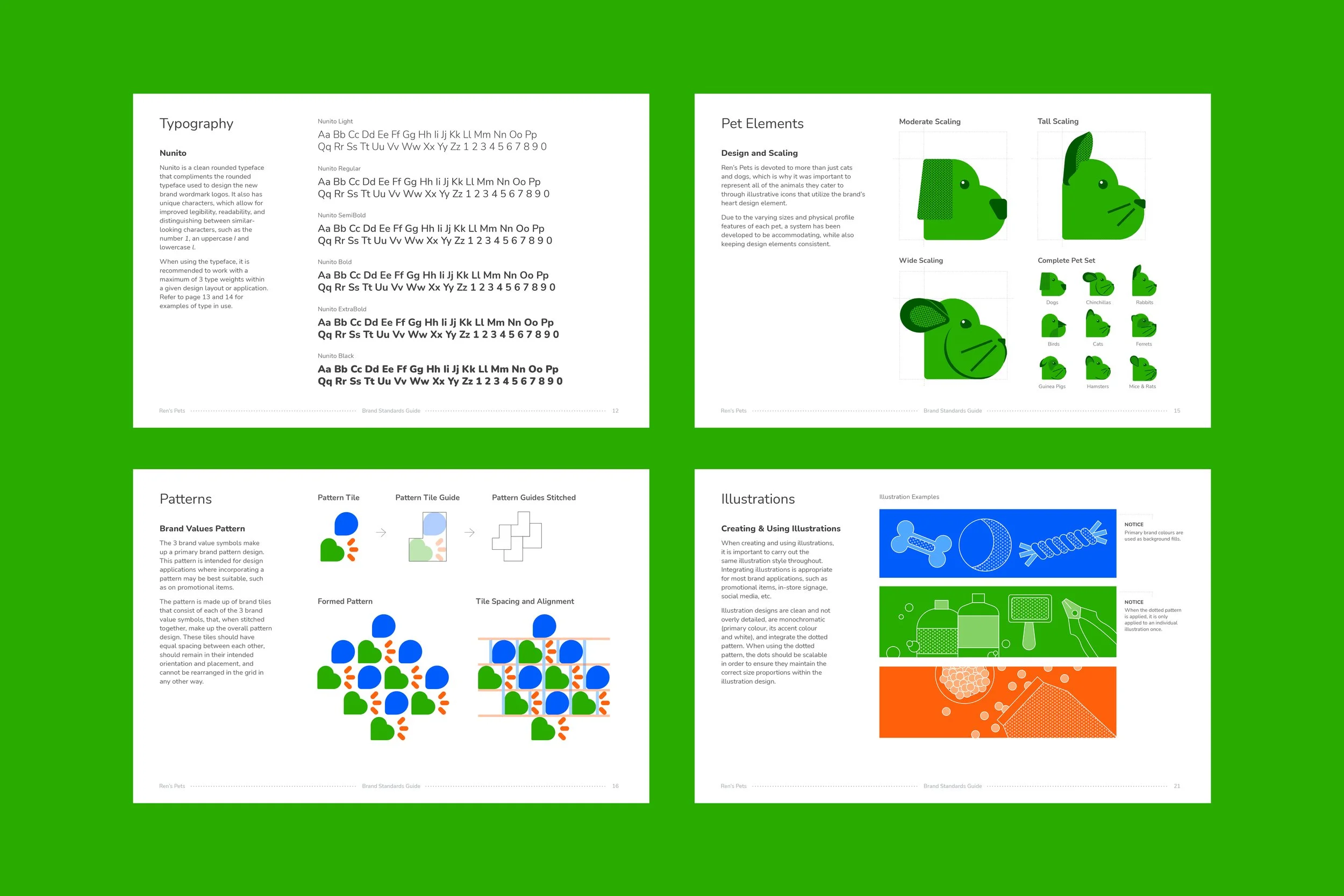
Ren’s Pets is a Canadian pet supply chain that prides themselves on their devotion to pets and their families, their customers, and their communities. They also believe that pets are deserving of the best quality products and care, and cater to a variety of pets, such as dogs and cats, bird, and several other smaller animals like as rabbits and guinea pigs.
-
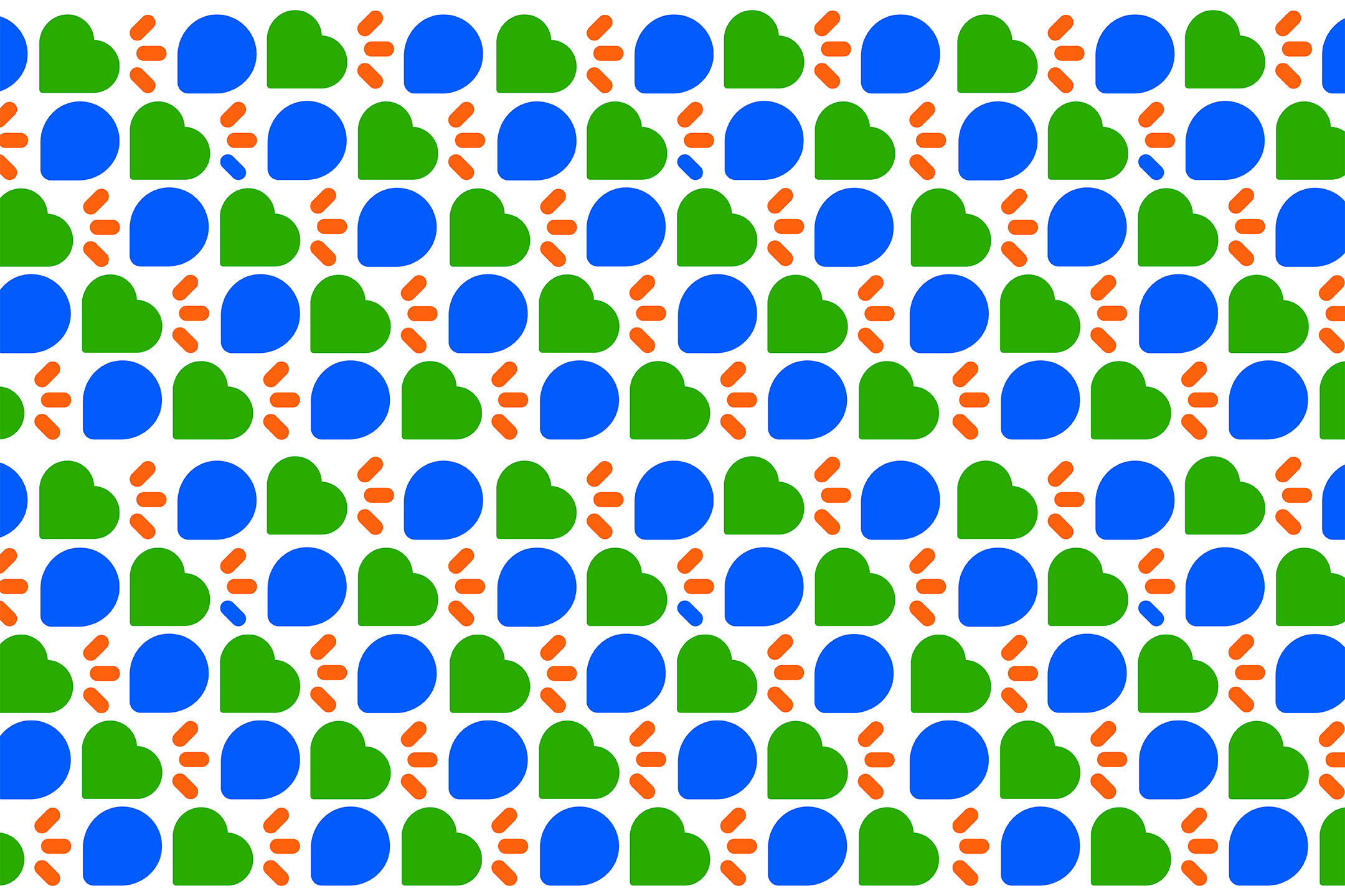
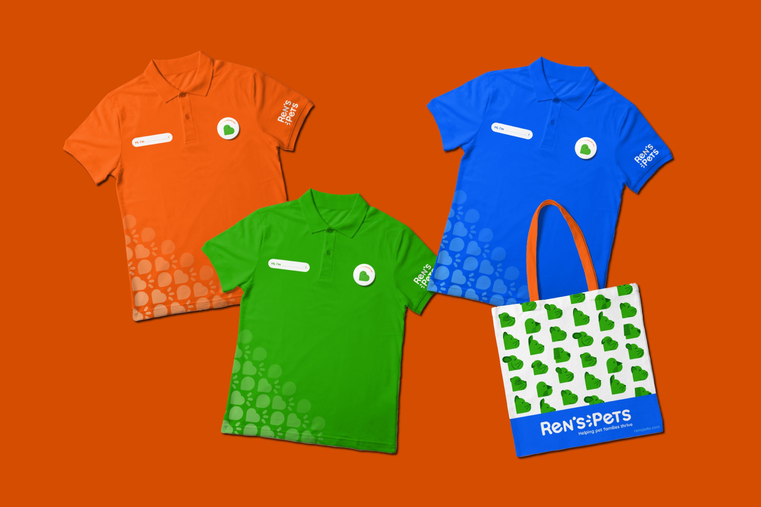
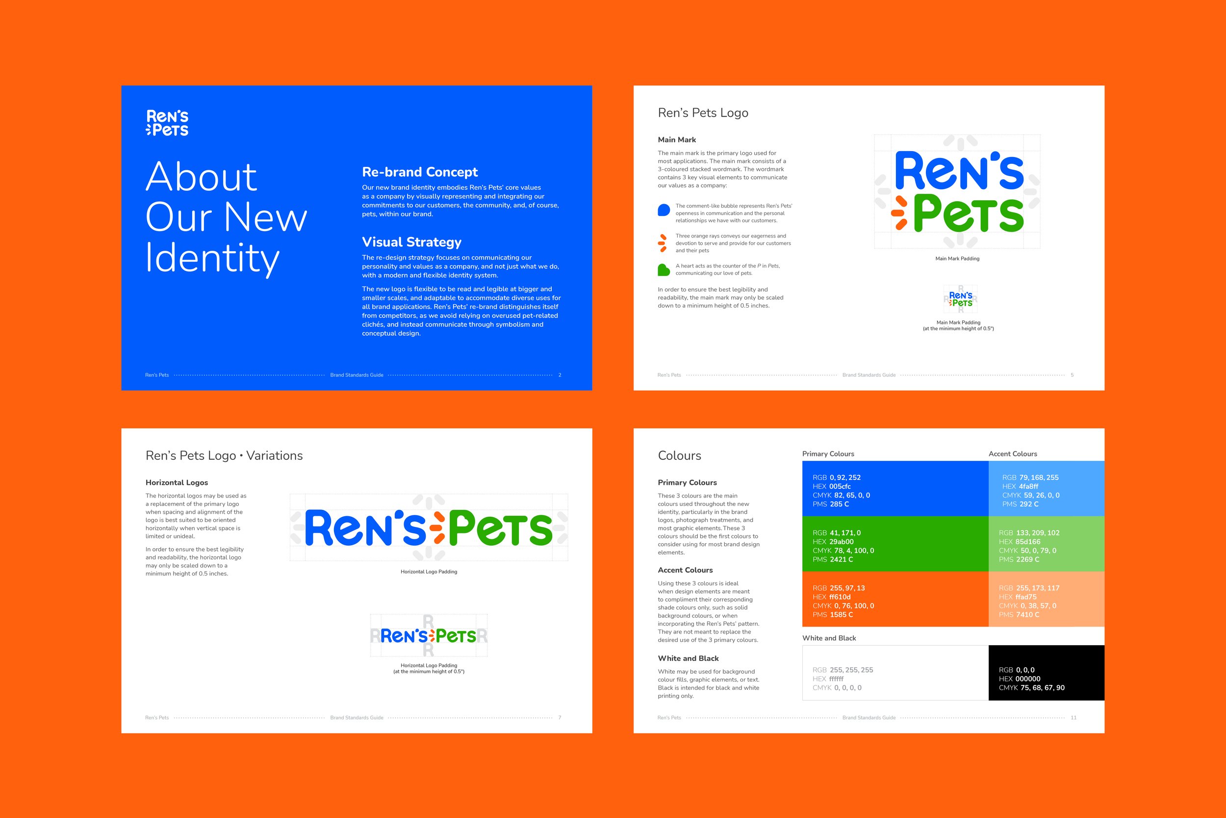
For this redesign for Ren’s Pets, the goal was to integrate their values and personality within their brand identity system in a modern and flexible design system, while also aiming to steer clear of the use of stereotypical animal visuals by using conceptual motifs in order to communicate their mission and purpose.
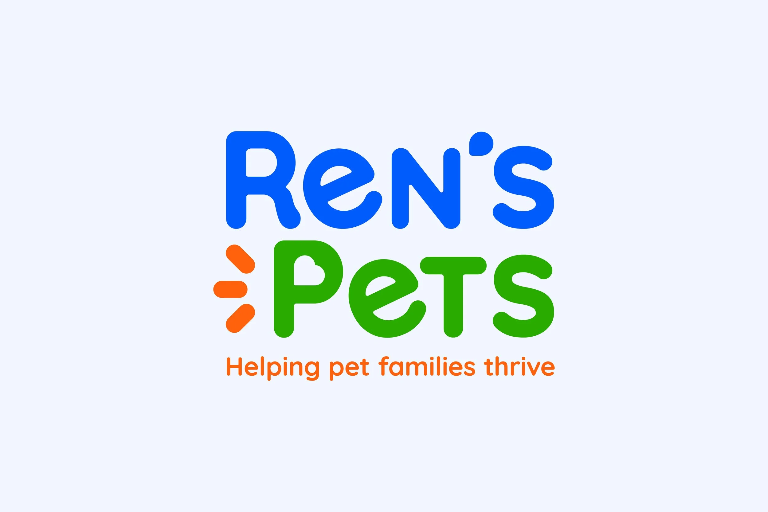
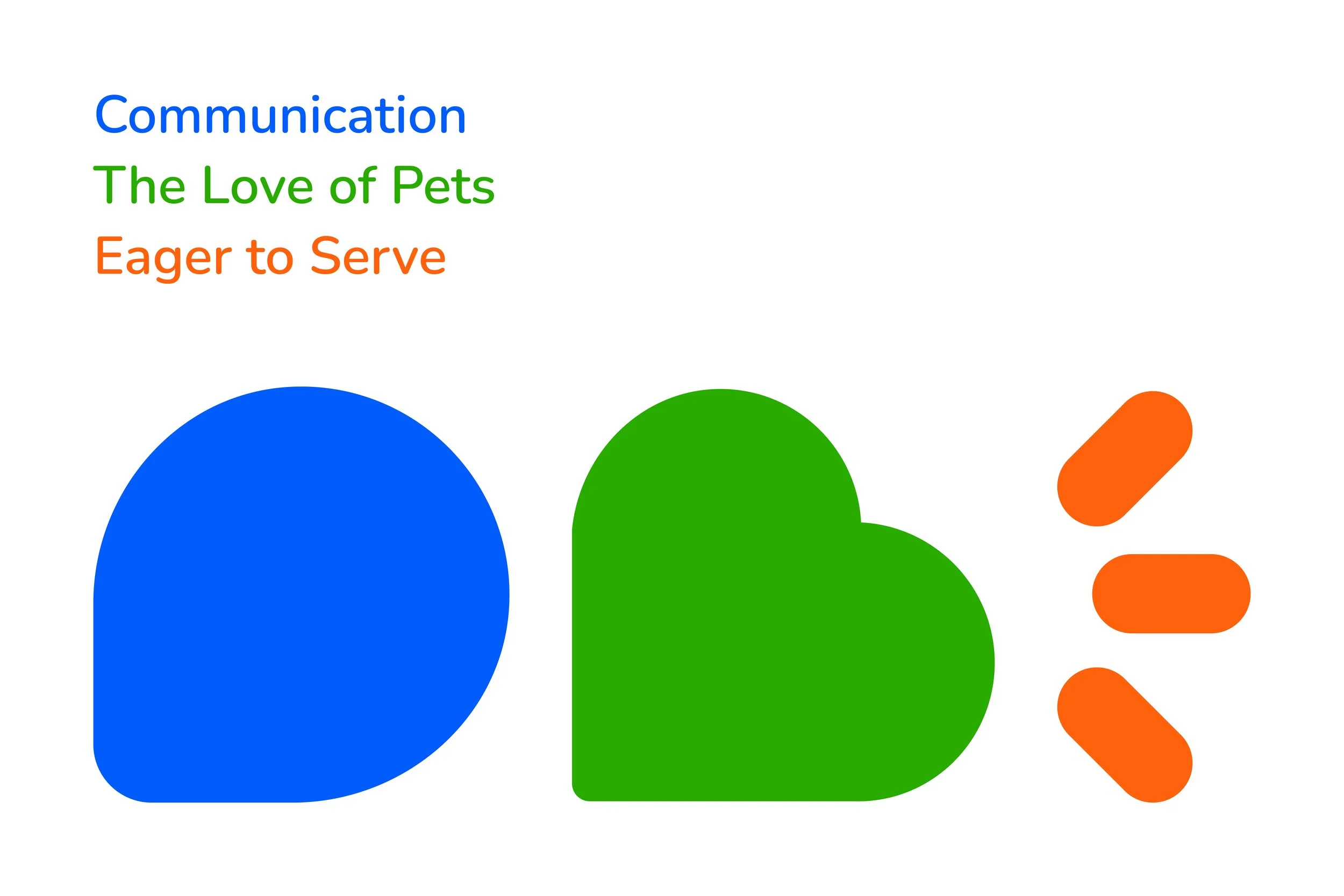
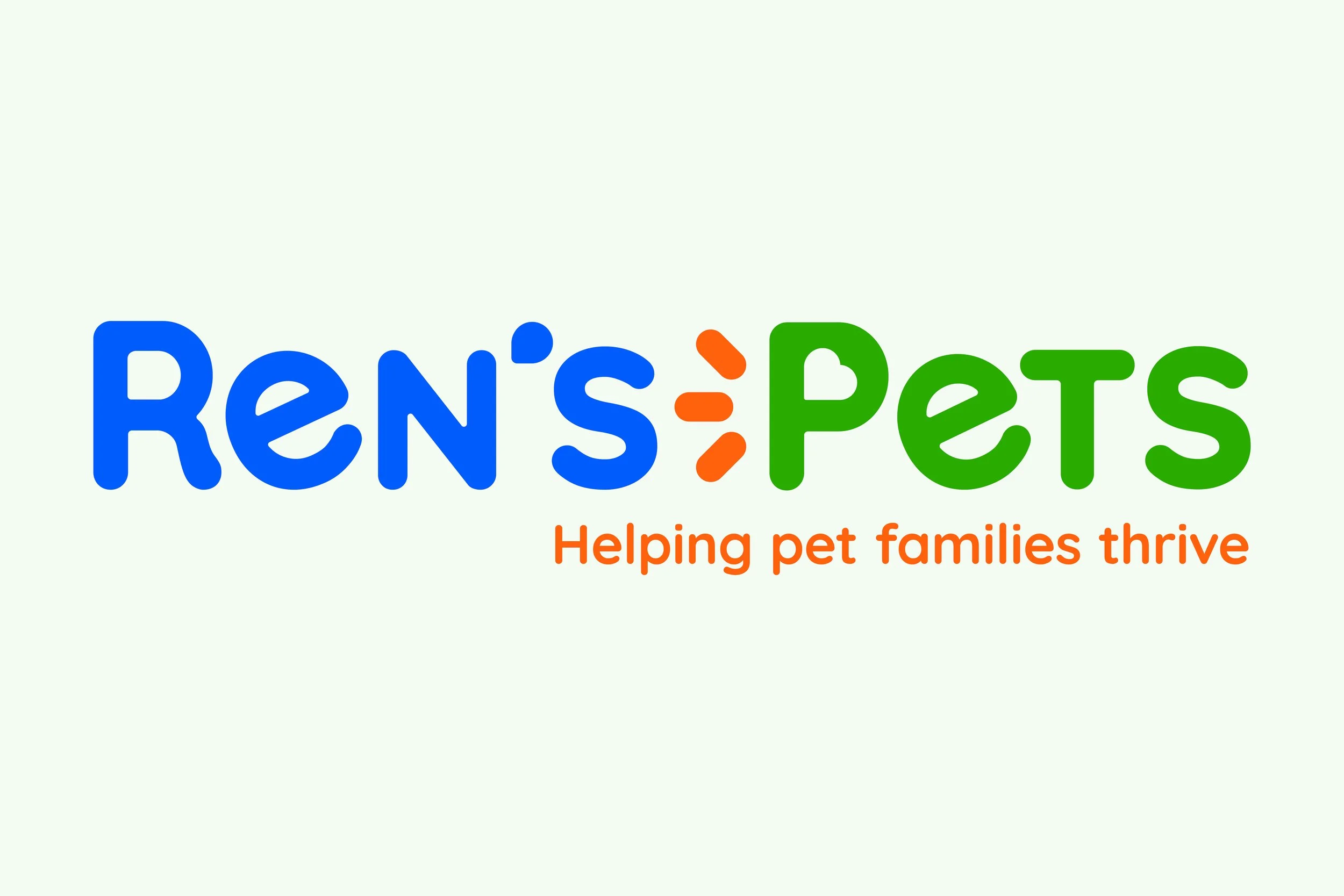
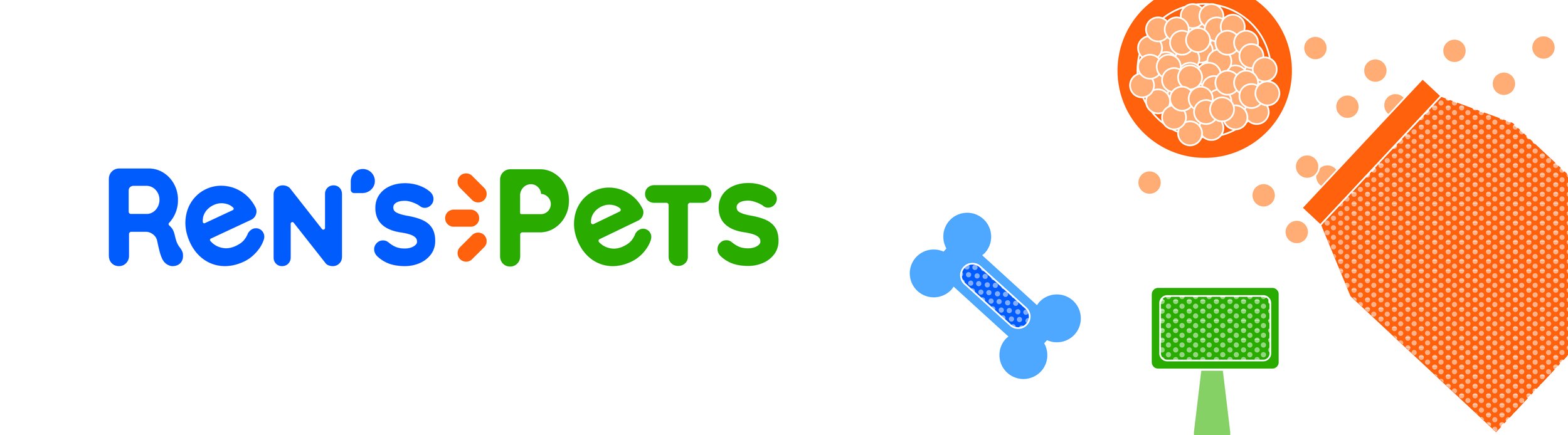
The redesigned logo is a stacked, 3-colour wordmark that incorporates 3 major design elements to communicate their commitments to pet families: a comment-like apostrophe representing Ren’s Pets’ personal relationships with their customers; orange rays to convey their eagerness and willingness to provide and serve; and, a heart that makes up the counter-spacing in the letter P in “Pets”, for their love and admiration of pets.
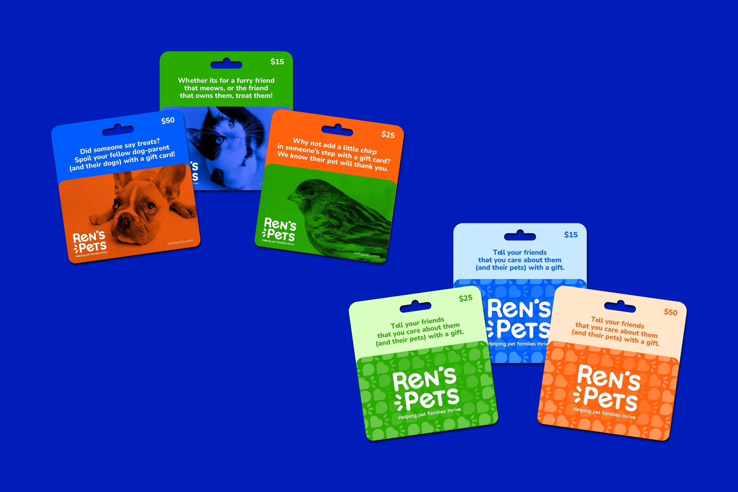
This redesign also consists of an updated tagline: Helping pet families thrive.